
Client: APCSW
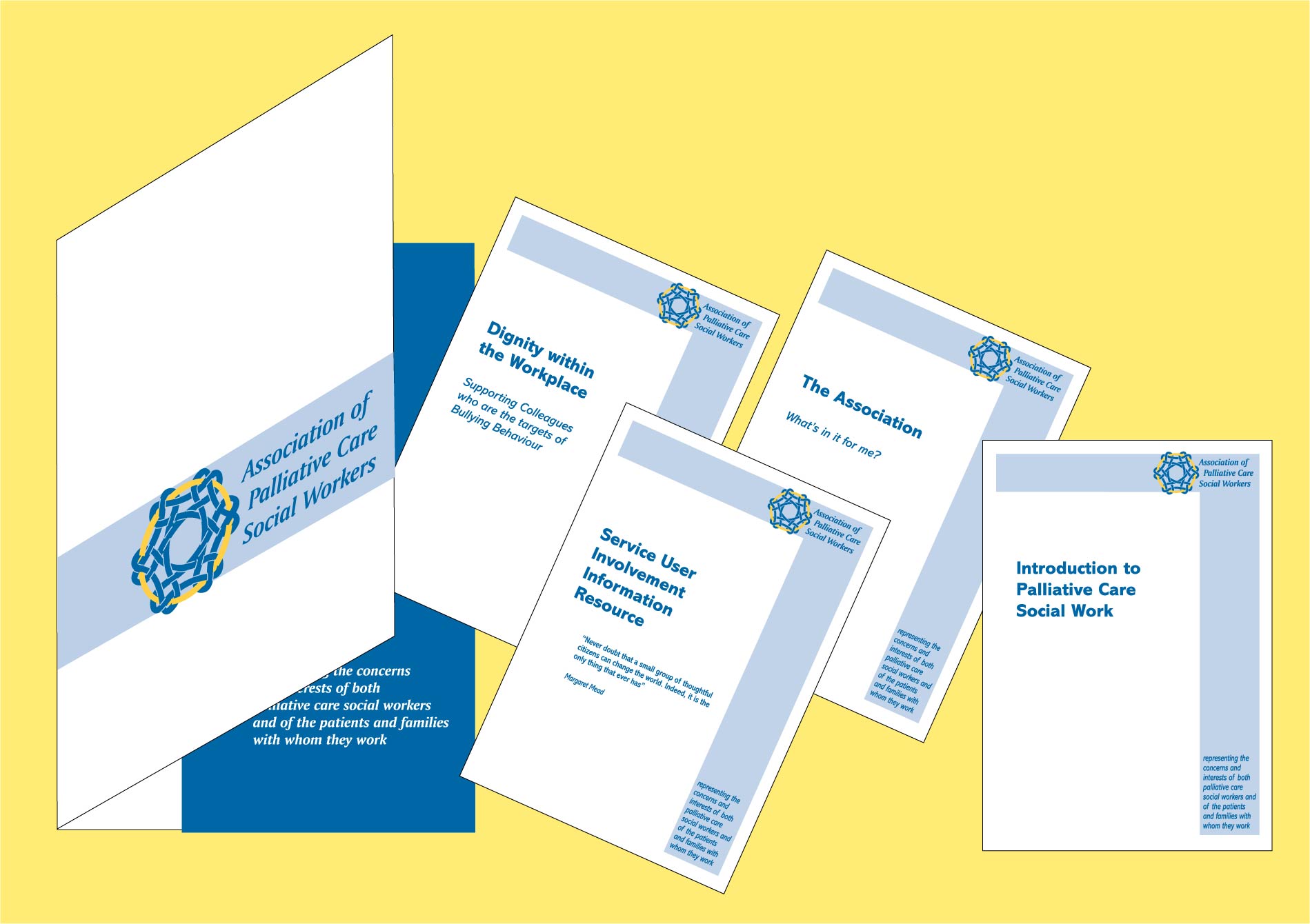
The logo I designed for The Association of Palliative Care Social Workers reflects their members' view of their work, as being interconnected with clients and colleagues; heart comes into it too. I perceived a golden thread running through their work as well. I carried the style through into booklets and stationery in a style they could replicate for themselves using Microsoft Word.